
How to Design a Website for Different Screen Sizes
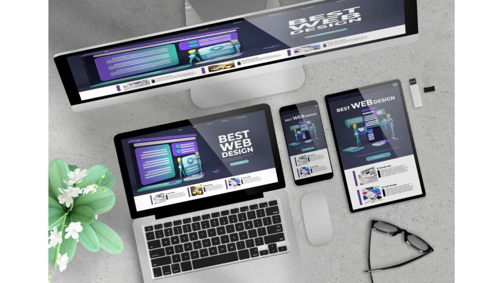
In today’s digital world, people access websites from various devices, such as desktops, laptops, tablets, and smartphones. Each device has a different screen size and resolution, which affects how the website looks and functions. Therefore, it is essential to design a website that can adapt to different screen sizes and provide a consistent and optimal user experience. This is called responsive web design.
Responsive web design is a technique that uses flexible layouts, images, and media queries to adjust the website’s appearance and behaviour according to the device’s screen size and orientation. This way, the website can fit any screen size without requiring the user to zoom in or out, scroll horizontally, or miss important information.
This blog post will answer common questions about responsive web design and provide tips and best practices for creating a website that works well on different screen sizes.
What are the benefits of responsive web design?
Responsive web design has many benefits for both website owners and users, such as:
- Improved user experience: Responsive web design ensures that the website is easy to use, read, and navigate on any device, which improves user satisfaction and engagement.
- Increased reach and traffic: Responsive web design allows the website to reach more potential customers and visitors who use different devices, which increases the website’s exposure and popularity.
- Reduced maintenance and cost: Responsive web design eliminates the need to create and maintain separate versions of the website for different devices, which reduces the development time and cost, as well as the complexity and errors.
- Enhanced SEO and performance: Responsive web design improves the website’s loading speed, accessibility, and compatibility, which boosts the website’s ranking and performance on search engines and browsers.

How do you design a website for different screen sizes?
Designing a website for different screen sizes requires planning, testing, and optimization. Here are some steps and tips to follow:
- Define your target audience and devices: Before you start designing your website, you need to know your target audience and what devices they use to access it. This will help you determine the most relevant and standard screen sizes and resolutions for your website, as well as the content and features that are most important for your audience.
- Use a flexible grid layout: A grid layout is a way of organizing and aligning the elements of your website, such as text, images, buttons, and forms. A flexible grid layout is a grid layout that can resize and reposition the elements according to the screen size, using relative units, such as percentages, ems, or rems, instead of fixed units, such as pixels or points. This way, the elements can fit any screen size without breaking or overlapping.
- Use responsive images and media: Images and media, such as videos, audio, and animations, make your website attractive and engaging. However, they can also take up a lot of space and bandwidth, affecting the website’s loading speed and performance. Therefore, you need to use responsive images and media that can adjust their size and quality according to the screen size, using techniques such as:
- Image compression: Image compression is a process of reducing the file size of an image without compromising its quality. This can be done using tools such as Photoshop, GIMP or online image compressors such as TinyPNG or Compress JPEG.
- Image optimization: Image optimization is choosing an image’s correct format, resolution, and dimensions based on its purpose and content. For example, JPEG is a suitable format for photos, PNG is a suitable format for logos and icons, and SVG is a suitable format for vector graphics. Also, you should avoid using images that are more significant than the screen or container sizes. Use the srcset and sizes attributes to provide different image versions for different screen sizes.
- Media queries: Media queries are a feature of CSS that allows you to apply different styles and rules to your website based on the screen size, orientation, or other device features. For example, you can use media queries to hide, show, or resize images and media depending on the screen size or to change your website’s font size, colour, or layout for different devices.
- Use a mobile-first approach: A mobile-first approach is a design principle that suggests that you should design your website for the smallest screen size first and then gradually add more features and content for larger screen sizes. This way, you can ensure that your website is functional and usable on any device and prioritize the most essential and relevant information and elements for your audience.
- Test and refine your website: It is crucial to ensure it works well on different screen sizes and devices. You can use Chrome DevTools, Firefox Developer Tools, or online tools such as Responsive Design Checker or Responsinator to test and preview your website on various screen sizes and resolutions. You can also use tools like Google PageSpeed Insights, GTmetrix, or Pingdom to test and improve your website’s loading speed, performance, and SEO.


0 Comments